Air Sensor Dataset – Explore Applications

How are People in the Bay Area Using the Air Sensor Data?

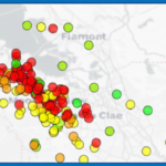
Since its creation, four different community-based organizations and three community researchers have used this public data resource for a range of interests, such as exploring local PM2.5 trends in their area and supporting data-focused youth training and education. The map below highlights some recent applications.


Click a point on the map to learn more!

Bay Area Map
×

Air Sensor Coverage across Polluters in Alameda, Contra Costa, and San Francisco

Air Quality Community Specialist Intern, Jacky Verduzco, from the Rose Foundation for Communities and the Environment's New Voices are Rising program embarked on an exploratory analysis of air quality across AB 617 neighborhoods throughout Alameda, Contra Costa, and San Francisco with the 2024 Air Sensor Dataset.

During initial reviews of the local data, Jacky was surprised to find that there were little to no air sensors near some major polluters, and decided to dedicate the rest of her analysis to describing the monitoring gaps across these neighborhoods and pollution sources, starting with EPA's Toxic Release Inventory data.

Air sensor coverage map
Figure 3. Air sensor coverage analysis across AB 617 neighborhoods showing monitoring gaps near major pollution sources

The analysis demonstrated that despite the high density of air sensors in the Bay Area, there are still data gaps in impacted communities which local monitoring efforts can help address. However, PM air sensors may not always be an effective monitoring solution as these sources often emit a variety of pollutants and PM may not always be a major component.

They compiled their visuals, maps, and charts into an accessible social media infographic and shared their findings with others across the three counties and larger Bay Area.

×

Hyperlocal Air Quality Analyses in South San Francisco and San Bruno

Students from the Stanford Data Sciences and Social Systems Capstone program in partnership with community-based organization Rise South City, leveraged the dataset, alongside newly available data from Clarity monitors, to develop a comprehensive understanding of air quality patterns and trends across South San Francisco and San Bruno, where historically, hyperlocal air quality data has been limited.

The dataset empowered students to explore the relationship between PM2.5 levels and key socioeconomic health metrics and understand local long-term trends, such as broad temporal patterns and seasonal variation in PM2.5 concentrations.

Seasonal PM2.5 chart
Figure 2. Seasonal mean PM2.5 concentrations (EPA-corrected) across all South San Francisco and San Bruno sites from 2018 to 2023

Key Findings

The analysis revealed clear seasonal patterns in PM2.5 concentrations across South San Francisco and San Bruno from 2018 to 2023, demonstrating significant variation throughout the year and providing valuable insights for community health planning and environmental advocacy efforts.

×

Youth Data Training and Advocacy in East Palo Alto

Benjamin Xie at Stanford University, in collaboration with East Palo Alto Academy and local community-based organizations Climate-Resilient Communities and Fresh Approach, used the dataset to support a data science education exercise with youth from East Palo Alto.

The goal was to build the group's capacity to use data to support local environmental advocacy. Using the Common Online Data Analysis Platform (CODAP), youth explored monthly-averages of the Air Sensor Dataset and learned essential data organization skills, such as data grouping and filtering.

CODAP interface
Figure 1. Common Online Data Analysis Platform (CODAP) interface showing air quality data exploration exercise

Students tested their knowledge through a short multiple-choice quiz, gaining hands-on experience with real-world environmental data while developing critical analytical skills that can be applied to community advocacy efforts.

Quiz tool
Quiz assessment tool used to test students' understanding of data analysis concepts

Educational Impact

This initiative not only provided valuable technical skills but also empowered young people to engage with environmental issues affecting their community using data-driven approaches, fostering a new generation of environmental advocates equipped with modern analytical tools.

How is the Bay Air Center Using the Air Sensor Dataset?

Daily PM2.5 during the Fall 2020 Wildfire Season
In this recording, daily PM2.5 from the Air Sensor Dataset is explored during the Fall 2020 wildfire season. Through daily examples, we see how the air sensor network can support our understanding of air quality in the Bay Area, by filling in areas in between the Air District’s network to create a more complete picture of wildfire smoke.
Air Sensor Access across Bay Area Communities
In this example, the Air Sensor Dataset is used to explore how access to air sensors has changed over the years across Bay Area overburdened and non-overburdened communities (2018-2022). Informational Graphic
Air Sensor Access across Bay Area Communities
Hourly PM2.5 during the Aug 2020 Woodward Fire
In this recording, hourly data from the Air Sensor Dataset is explored on Aug 18th 2020, during which the Woodward wildfire was growing in Point Reyes National Seashore on the peninsula in Marin County, and when specific meteorological conditions led to particularly narrow smoke transport into the San Francisco bay. This analysis serves a great example of how we can use sensor data to track smoke plumes across the Bay Area.

How is the Air District Using the Air Center Dataset?

Woodsmoke Monitoring
Woodsmoke can be a significant contributor to elevated PM2.5 in the Bay Area. The Bay Area Air District explored this pollution with the Air Sensor Dataset, focusing on specific woodsmoke-impacted days (identified through common woodsmoke markers: elevated black carbon, brown carbon and PM2.5/CO enhancement ratios). Evaluating the relative differences from sensor to sensor on these days for both uncorrected and adjusted (EPA-corrected) data can then be used to identify spatial patterns.
Side-by-side comparison maps showing uncorrected versus EPA-corrected PM2.5 data across the Bay Area on December 22, 2022, with color-coded dots representing air quality levels

Stay Informed

Subscribe
Skip to content